
For this Design Blitz assignment, I looked for examples of design concepts in everyday life. Instead of searching for professional designs, I focused on ordinary objects and spaces that I interact with regularly. Some of the examples demonstrate effective design principles, while others show how poor design choices can create confusion or clutter. This assignment helped me realize how much design influences the way we move through and understand our daily environments.
Rhythm- Kitchen shelves
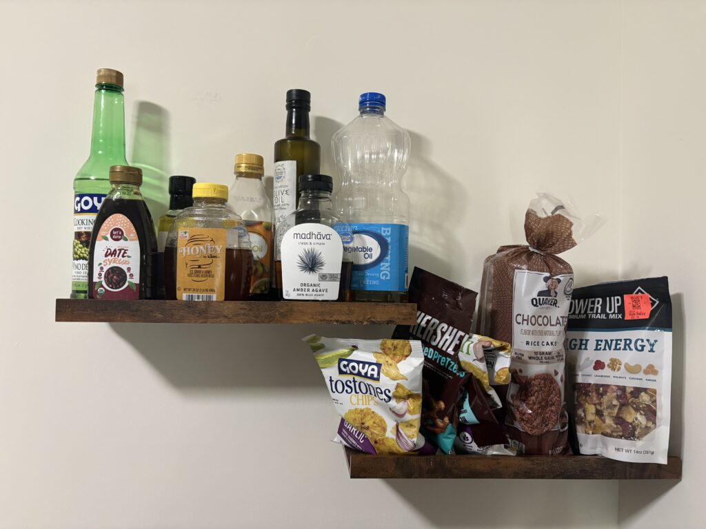
The image shows the shelves in my kitchen pantry. I chose this photo because it demonstrates rhythm through the repetition of bottles, containers, and food packages. Even though the items are different sizes and brands, the repeated shapes and arrangement create a visual pattern that guides the viewer’s eyes across both shelves.
As I look at the image, my attention naturally moves from left to right as I scan the rows of products. The repetition creates a sense of organization, even though the shelf is not perfectly arranged. Without that repetition, the image would feel much more chaotic and difficult to navigate visually.
This example helped me understand that rhythm is not limited to art or graphic design. It can be found in everyday spaces where repeated objects create movement and visual flow.
Design Technique Used: Rhythm through repetition and pattern.
Dominance- Coffee sign
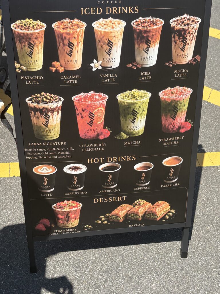
The coffee shop menu board displaying different drinks. I selected this photo because it is a strong example of dominance. The colorful drink images immediately stand out against the dark background and become the first thing viewers notice.
The design directs attention to the products before customers even begin reading the menu descriptions. Bright colors, large images, and strong contrast all work together to highlight the drinks and encourage purchases. The text is important, but it clearly plays a secondary role to the photographs.
This image demonstrates how designers intentionally guide viewers toward the most important information. In this case, the featured drinks are the dominant element of the design.
Design Technique Used: Dominance through color, contrast, and scale.
Form, Function, and Message- Dawn Powerwash bottle
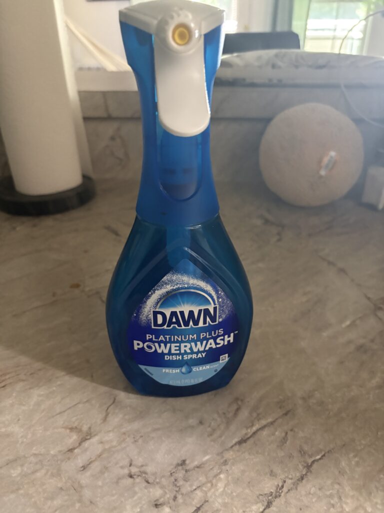
The third image shows a bottle of Dawn Powerwash. I chose this object because it clearly communicates its purpose through its design. Before reading any words on the label, the spray nozzle suggests that the product is meant to spray liquid onto a surface.
The shape of the bottle is comfortable to hold, and the trigger mechanism immediately signals how the product should be used. The design matches the product’s function, making it easy for users to understand without requiring detailed instructions.
This example reflects the idea that good design should communicate function clearly. The product’s form and message work together to make its purpose obvious.
Design Technique Used: Form, function, and message through intuitive product design.
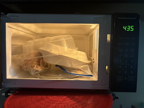
Minimalism & Use of Space (Bad Design Example)- Cluttered microwave
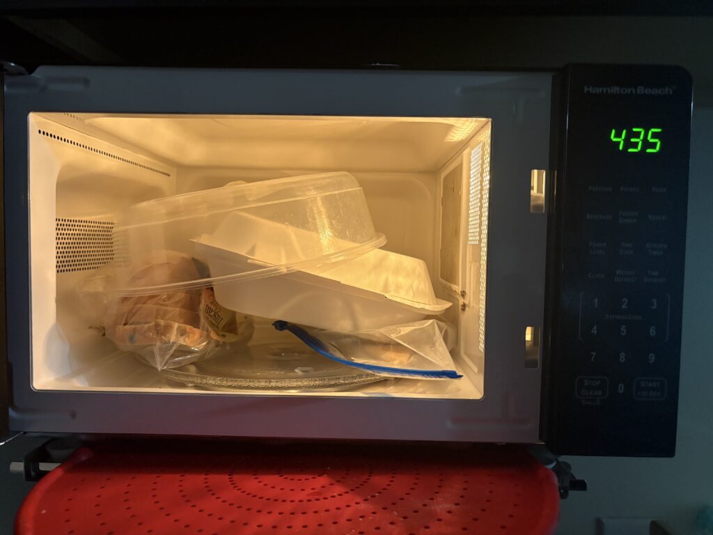
The final image shows an overcrowded microwave filled with containers and food items. I chose this image as a bad example of minimalism and use of space. Rather than feeling organized and intentional, the space appears cluttered and difficult to use effectively.
Minimalist design focuses on removing unnecessary elements and creating clarity. In this image, the opposite occurs. The crowded arrangement makes it difficult to identify items quickly or access them easily. The lack of open space creates visual confusion and reduces functionality.
Although this is not a professionally designed object, it demonstrates why intentional use of space matters. Seeing the negative example helped me better understand the value of simplicity and organization in design.
Design Technique Used: Minimalism and use of space (demonstrated through a lack of effective space management).
No responses yet